Designing the Identity for Thirty Third
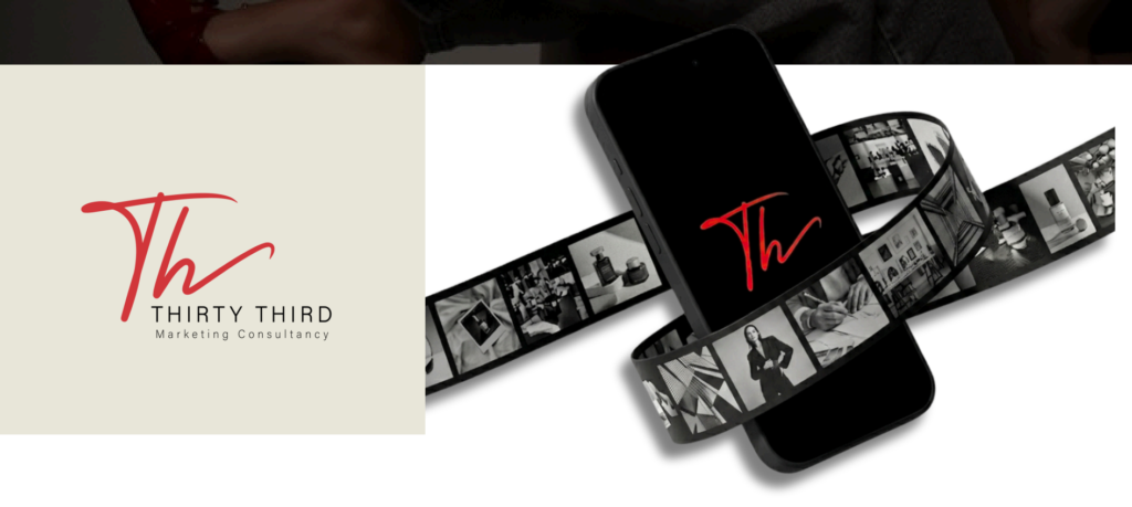
At MetaProduction, we believe that a brand is more than just a logo—it is a visual narrative. Recently, we had the privilege of working with Thirty Third, a marketing consultancy, to craft a visual identity that reflects their philosophy of growth, structure, and strategic communication.
The Concept
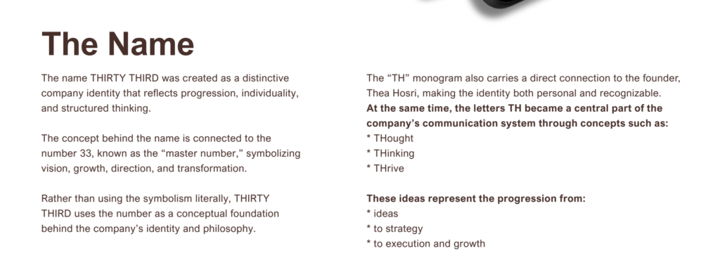
The name “Thirty Third” is derived from the “master number” 33, a symbol of vision and transformation. Our challenge was to translate this abstract concept into a tangible, professional identity. We focused on the progression from ideas to strategy, and finally to execution and growth.
Our Design Approach
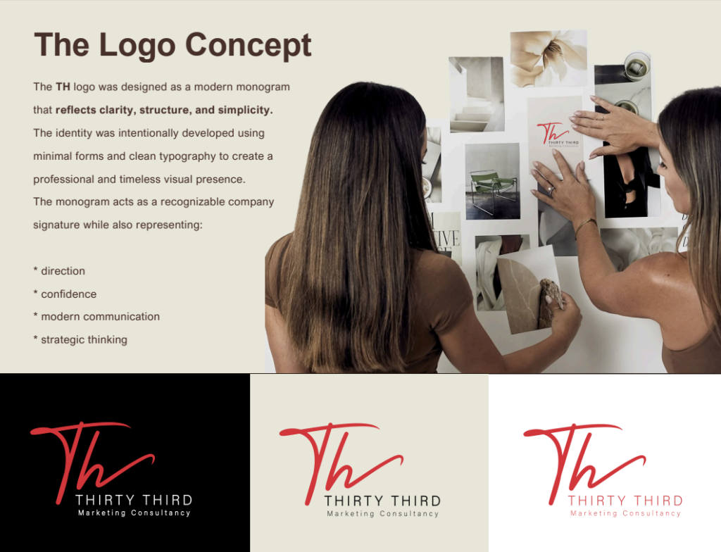
To represent the brand’s authority, we developed a modern monogram. Our design choices were rooted in clarity and simplicity:
The Monogram: The “TH” logo serves as a recognizable company signature, symbolizing confidence and modern communication.
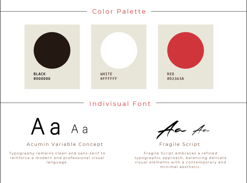
Typography: We selected Acumin Variable Concept for a clean, sans-serif look that reinforces a professional language, paired with Fragile Script for a refined, contemporary aesthetic.
Color Palette: By utilizing a bold Red (#D2363A) against crisp Black and White, we created a high-contrast identity that demands attention and communicates strength.
Why This Works
The resulting brand identity is timeless and structured. It isn’t just about looking good—it’s about aligning the visual experience with the strategic excellence that Thirty Third provides its clients.