Creating the Identity for Uncle Mike
Branding is about capturing the “vibe” of a business and making it unforgettable. When we worked on the branding for Uncle Mike, our goal was to bridge the gap between classic elegance and a bold, approachable market presence.
The Design Philosophy
The Uncle Mike brand required a visual identity that felt both sophisticated and warm. We moved away from cold, clinical designs to something that felt grounded and recognizable.
Key Elements of the Identity
Our branding process focused on creating a versatile, memorable footprint:
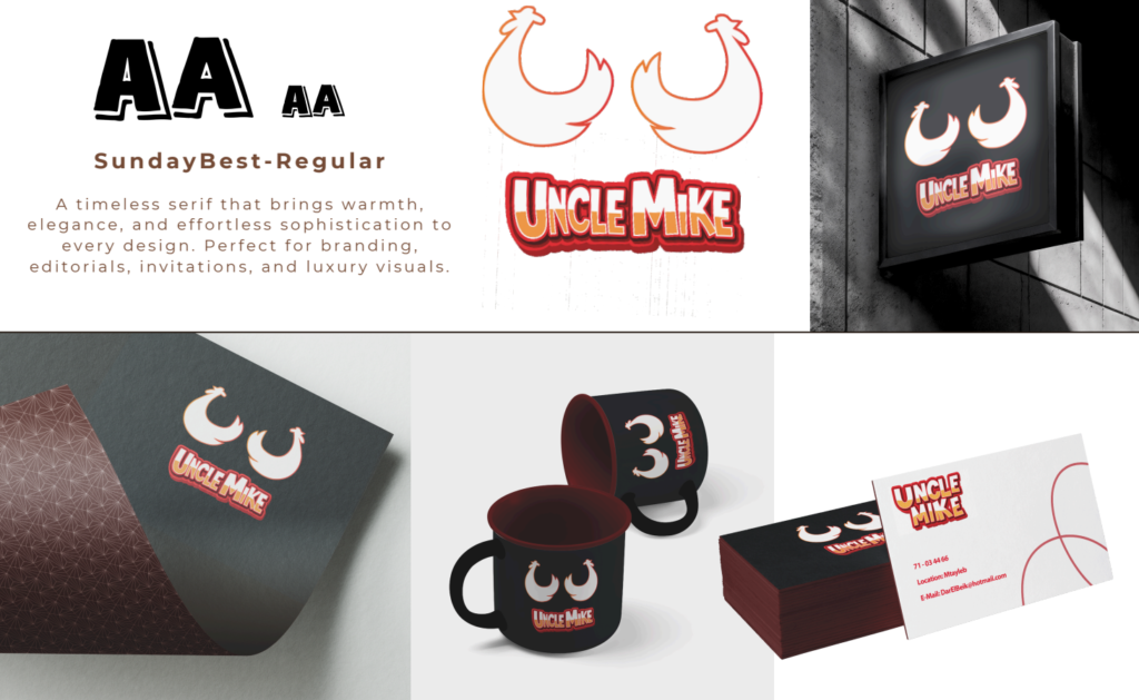
The Logotype: We implemented Sunday Best-Regular, a timeless serif font. This choice brings an effortless sophistication and warmth to the brand, making it ideal for everything from luxury visuals to daily digital content.
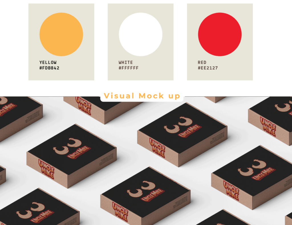
The Color Palette: We chose a vibrant Yellow (#FDB842) and a striking Red (#EE2127), anchored by clean white. This combination is energetic, optimistic, and highly visible in a crowded market.
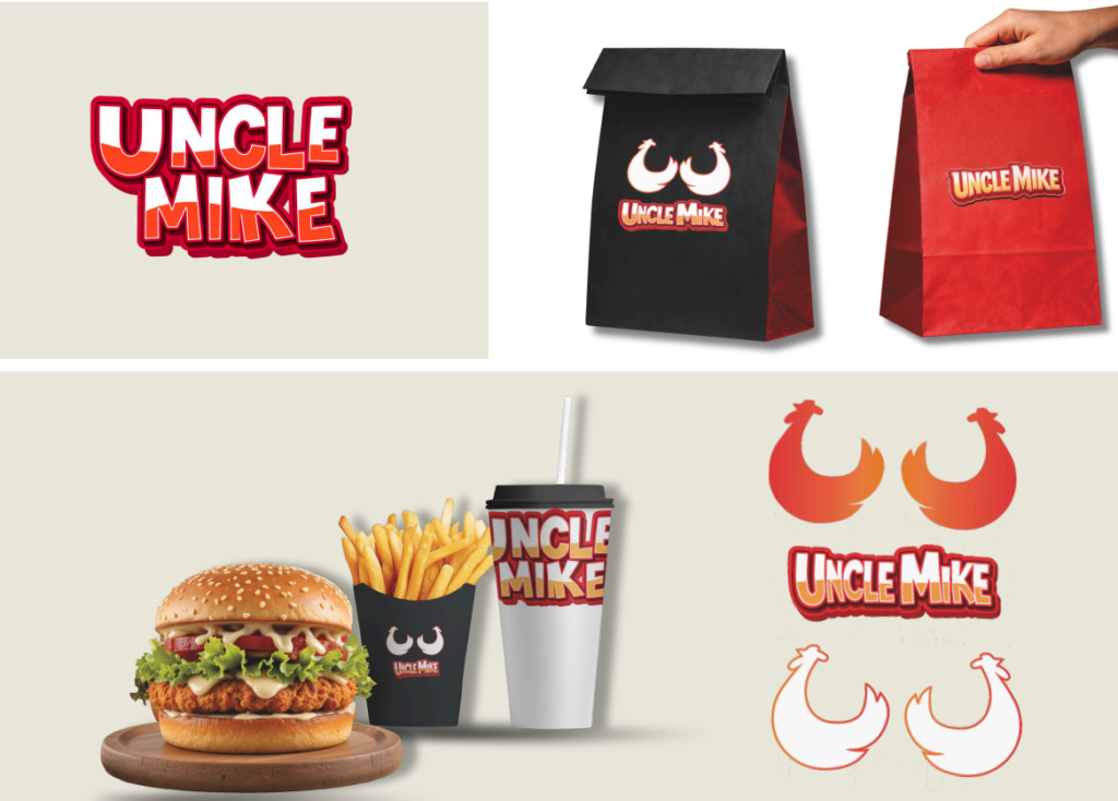
Versatility: Whether used on packaging, social media, or signage, the Uncle Mike identity remains consistent, scalable, and impactful.
The MetaProduction Edge
At MetaProduction, we don’t just design; we curate. For Uncle Mike, we ensured that every element—from the typography to the color palette—works together to create an inviting customer experience.